-
Remmelzwaal Pro Management
Art direction and design for Remmelzwaal Pro Management Business card and website design: Soonhwa Kang Logo and pictogram design: Romy Maasdam
-
Bits Academy
Bits Academy Logo, website and icon design I joined the design team at the social design studio, Butterfly Works in Amsterdam to create the identity and web-design of the Bits Academy. Bits Academy is the digital learning environment of the five Bits Schools in Africa. These schools exist to promote positive change in the lifestyles…
-
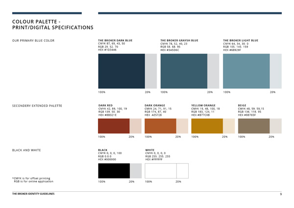
The Broker
Rebranding projects for The Broker. Style guide, Brochure design, Info graphics, Business card, Stationery design. Web design and Logo restyling
-
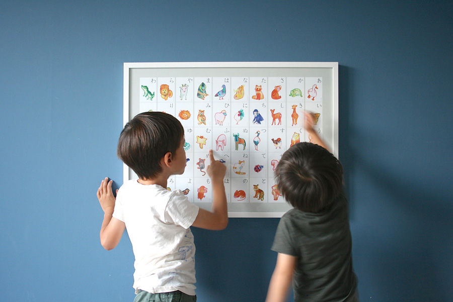
Animal Hiragana Poster by Hanato Morito
Art direction and design of poster, logo and cards/Website setting for self initiated project Illustration: Fumi Morimoto www.hanato-morito.com Collaborating with Fumi Morimoto, I launched Hanato Morito to create the products for inspiring parents and kids. Please check our first product “Animal Hiragana Poster” here. Our poster is featured in “MJ Illustrations Book” published by Pie Books. イラストレーターの森本ふみさんと一緒に、どうぶつひらがなポスターをつくりました。 自分の息子がひらがなに興味を覚え始めた時に、産まれて初めてふれる文字を学ぶという体験を特別なことにできないかと考えたからです。 結果、インスパイアされるような美しいどうぶつのイラストと、正しく読みやすい書体を使用したポスターになりました。私の子どもだけではなく、また日本の住んでいる子どもたちだけでなく、海外で育っている日本の子どもたちにも好評です。 現在は日本でのみHANATO…
-
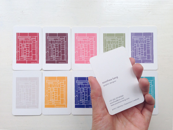
My cards
In Japan, we have the proverb “Tonin-Toiro” which means, if there are 10 people, then there are also ten colors: ways, characters. Therefore in creating a set of business cards, I wanted to include some diversity as each person receiving the card is different. I also believe that business cards could be a great…